How To Use PodcastRE's Term Frequency Line Graph Tool
As PodcastRE's database of podcast series and episodes continues to grow, PodcastRE's database of metadata will also continue to grow. In fact, each new series and episode adds so much new metadata that it can get a little overwhelming. How is one to comb through all of that information and shape it into more easily extractible information? One possible answer: our term frequency line graph tool. Here's how to use it:
Entering a term into the search bar will search for that term in any of its possible appearances, whether that be in the title of the podcast, the episodic summary, the keywords, etc. This search will then be represented on a temporally arragned line graph, which can be sorted by month or by year.
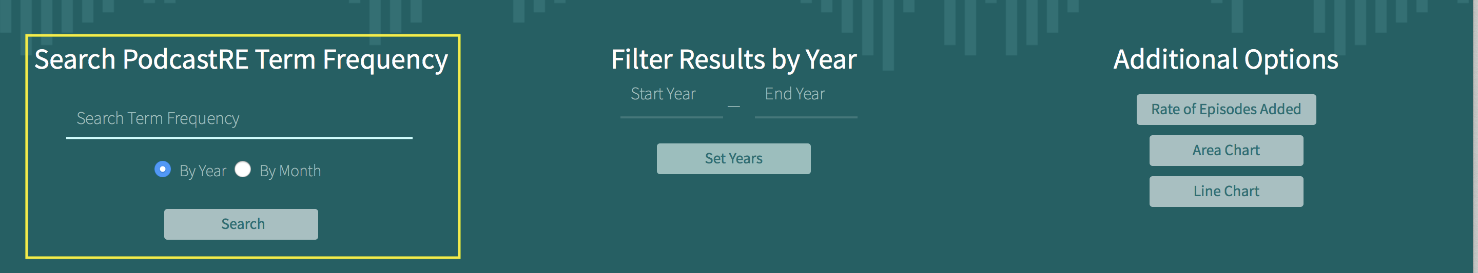
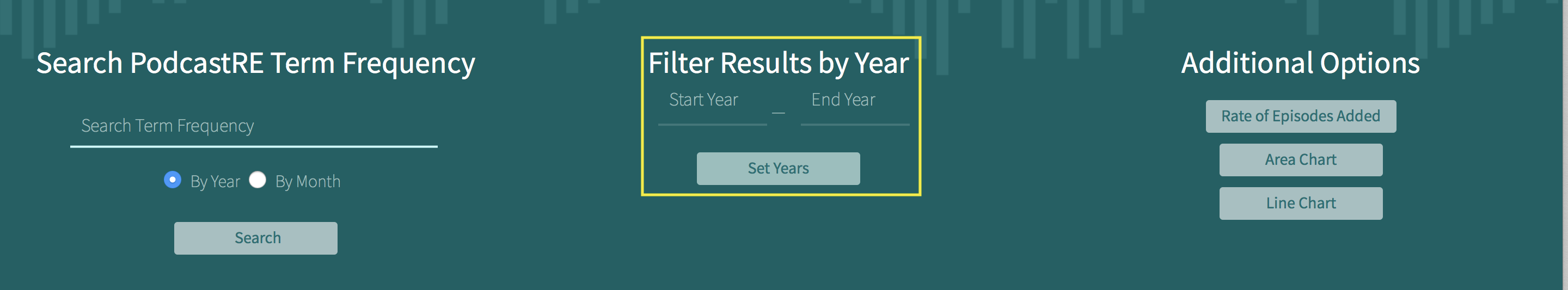
By default, the resulting graph will start at the term's first apperance in our database and end at its most recent. You can, however, restrict your search to a smaller set of years.
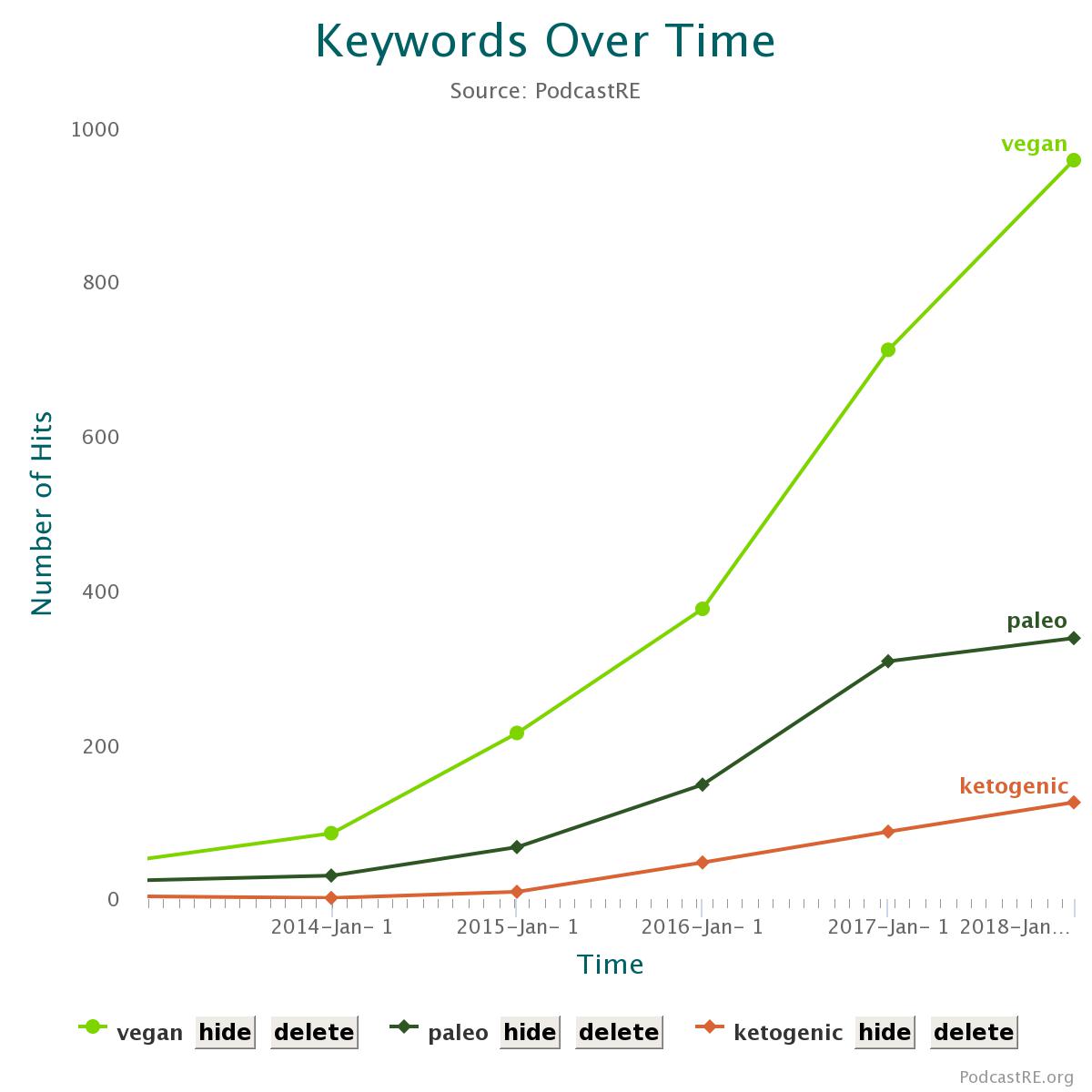
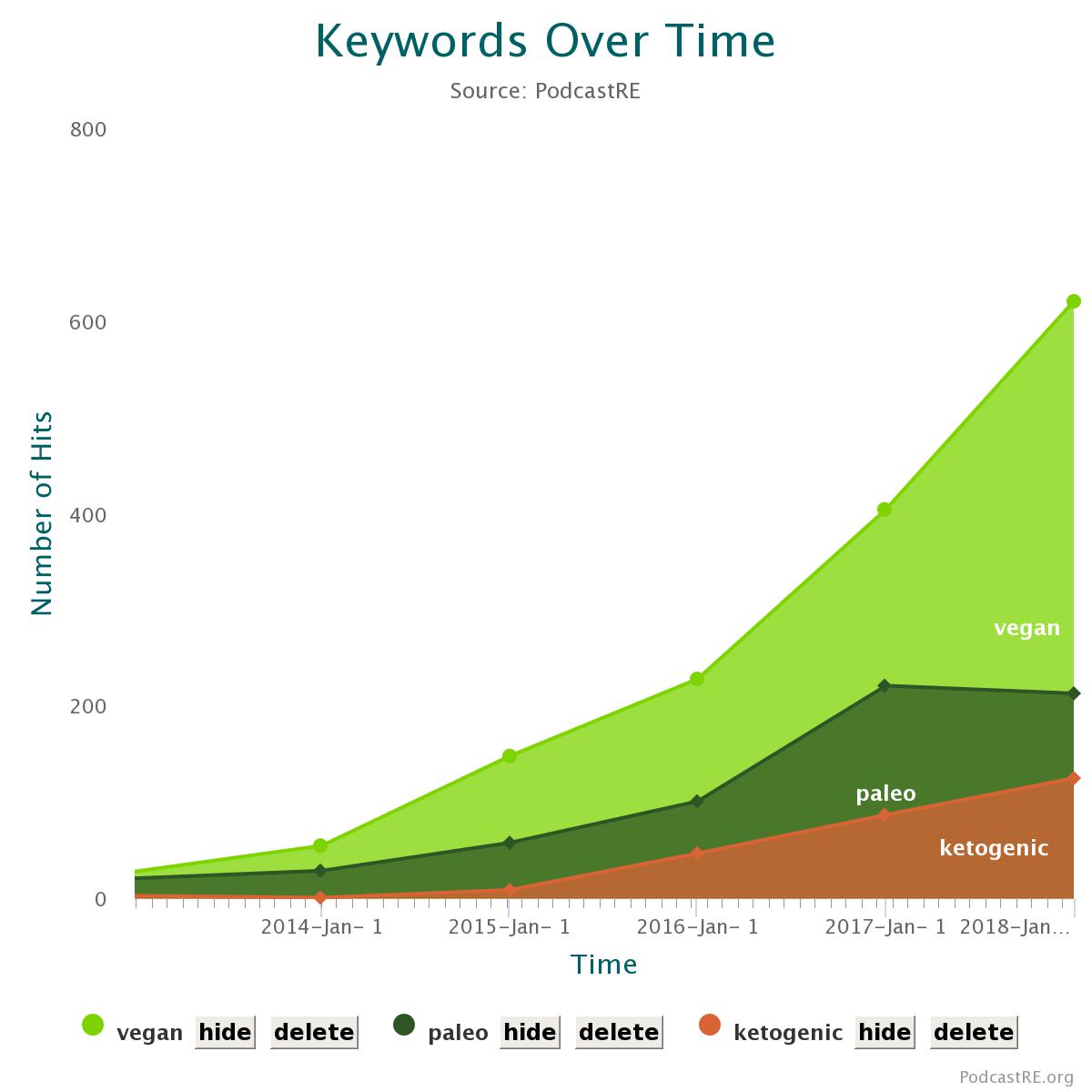
The term frequency line graph tool allows you to run multiple searches, providing you with the ability to make comparisons such as the one on alternative diets found below.
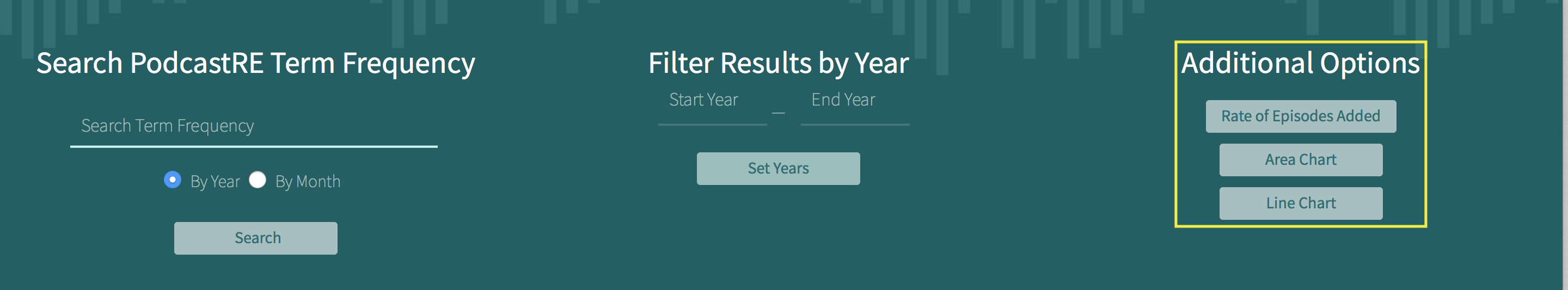
The "Line Chart" and "Area Chart" buttons on the top right side of the page allow you to switch between two different views.
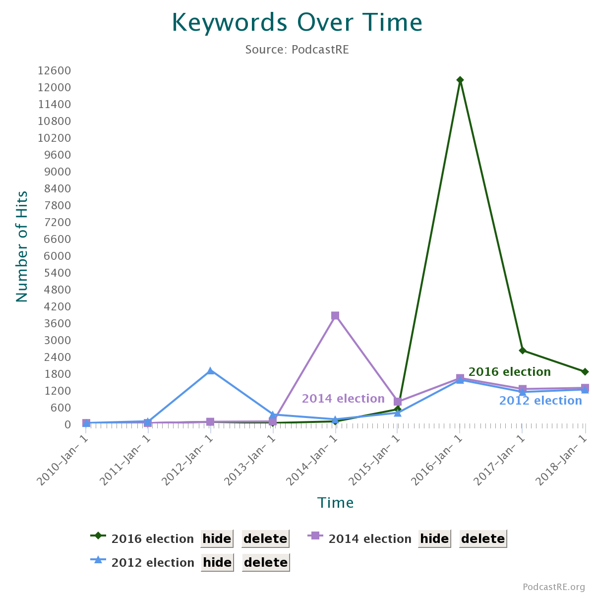
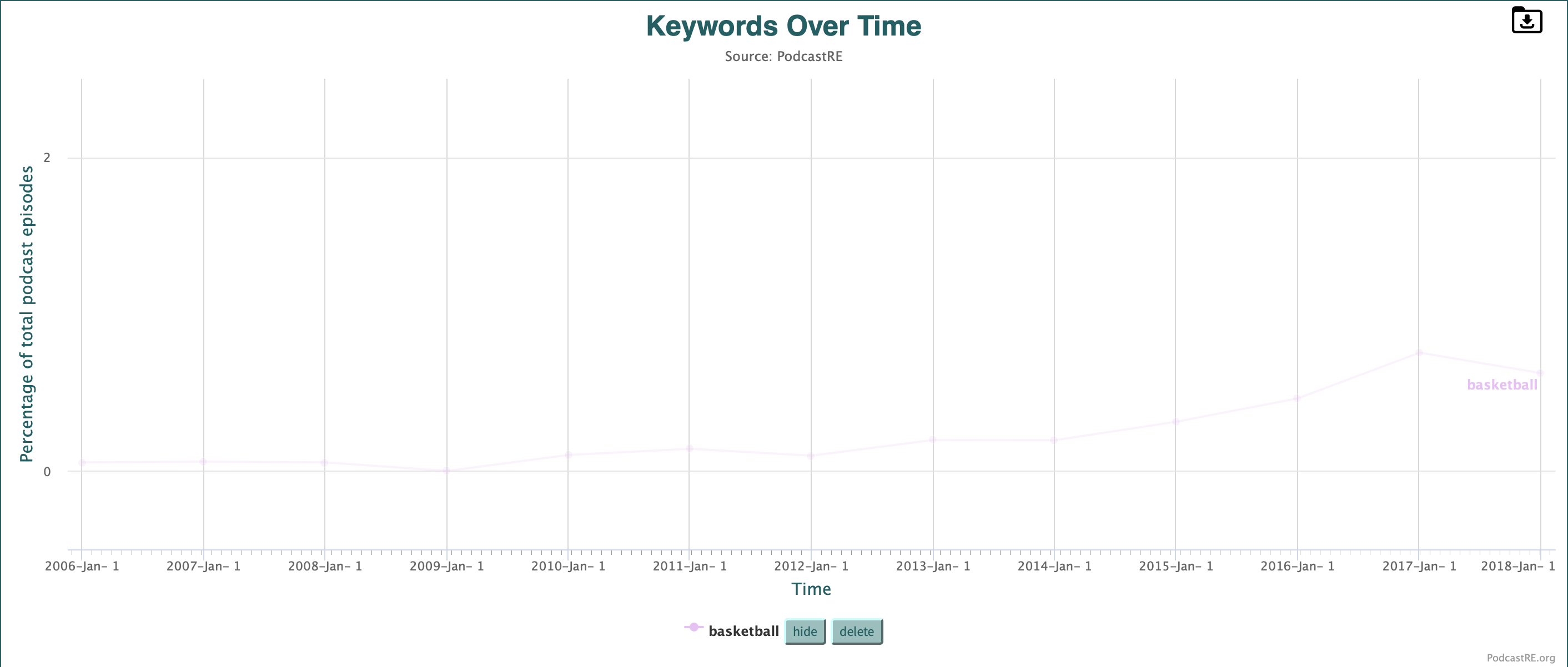
Because our database (and the world of podcasting more generally) tends to favor the recent past over the early days of the medium, most searches will likely show continual upward growth, though certainly some shortly relevant topics will not (see, for instance, the graph of elections below).
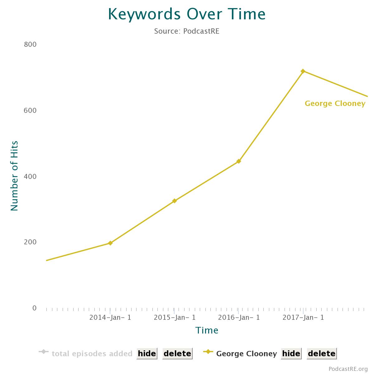
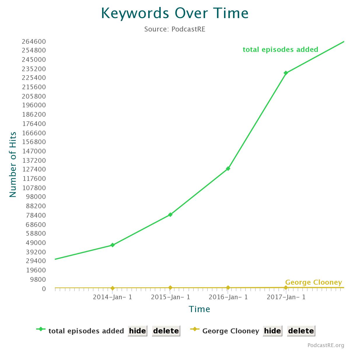
In order to give users a more accurate sense of changing podcasting trends, we have provided a button that automatically adds a helpful line to the chart: by clicking "Rate of Episodes Added", the graph will then show how term trends correspond to overall episode trends. In the first graph below, for example, it may look as if George Clooney witnessed a huge uptick in popularity between 2016 and 2017, but this upward trend actually corresponds with a greater number of podcasts added. The "Rate of Episodes Added" button, then, allows you to make more measured assessments of individual trends.
Users may also click the "Normalize results by Total Episodes in PodcastRE" button to account for this bias.
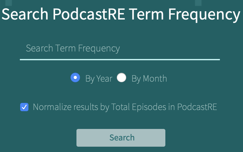
Running a search with this option checked will search for the percentage of total podcast episodes which feature your chosen keyword instead of the total mentions of that keyword. Importantly, choosing this option will clear any previous graph you may have made using the default settings since the two searches employ different y-axes (percentages vs. total appearances). This also means that switching back to the default settings will likewise clear any previous graph you may have made using the "normalize" button. Normalized graphs feature scaled y-axes, so be sure to check the resulting axis for the highest percentage value represented before making any conclusions on appearance alone.
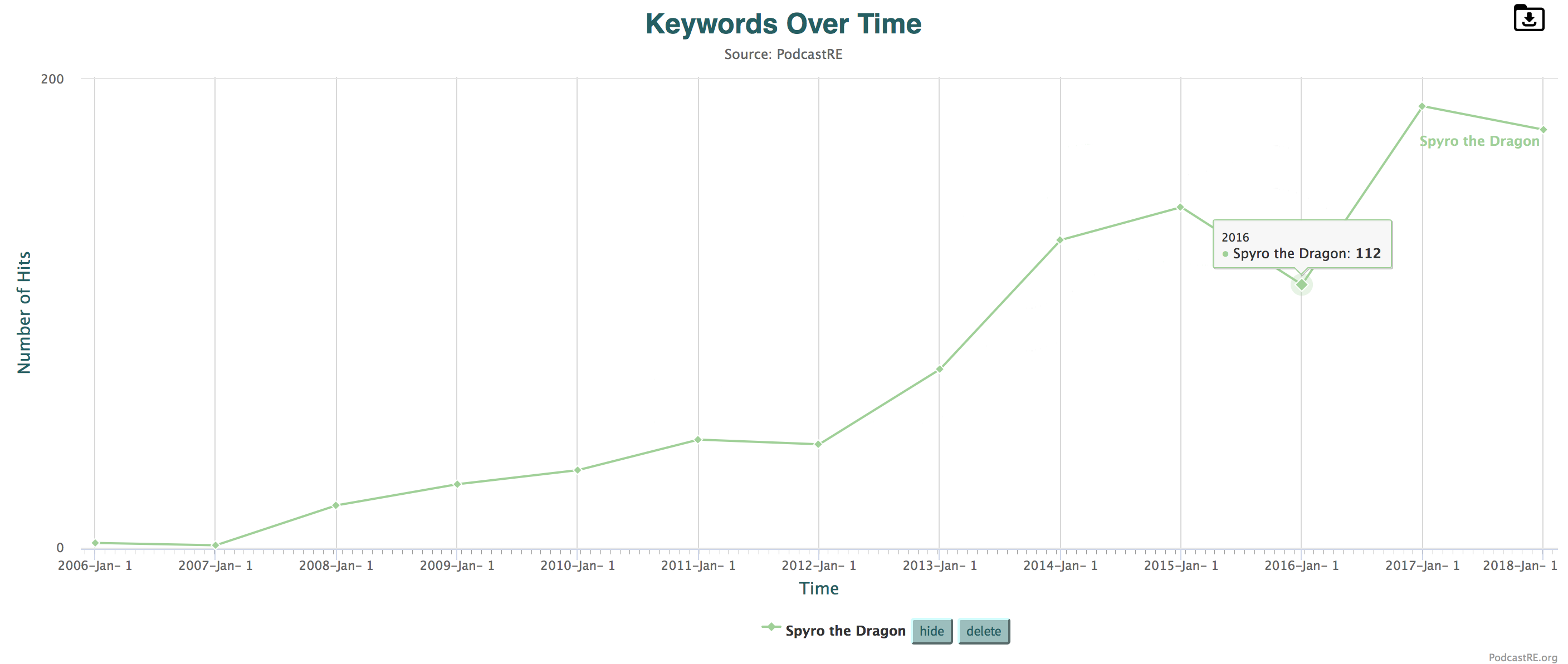
The points on PodcastRE's line graphs are also fully interactive. Scrolling over any of your graphs points will provide you with the total number of appearances in the time period in question. And say you want to know, for instance, from where each of those 112 mentions of "Spyro the Dragon" in 2016 came. Simply click on the point in question, and you will be taken to a search that shows each of the programs and episodes that featured the friendly purple dragon.
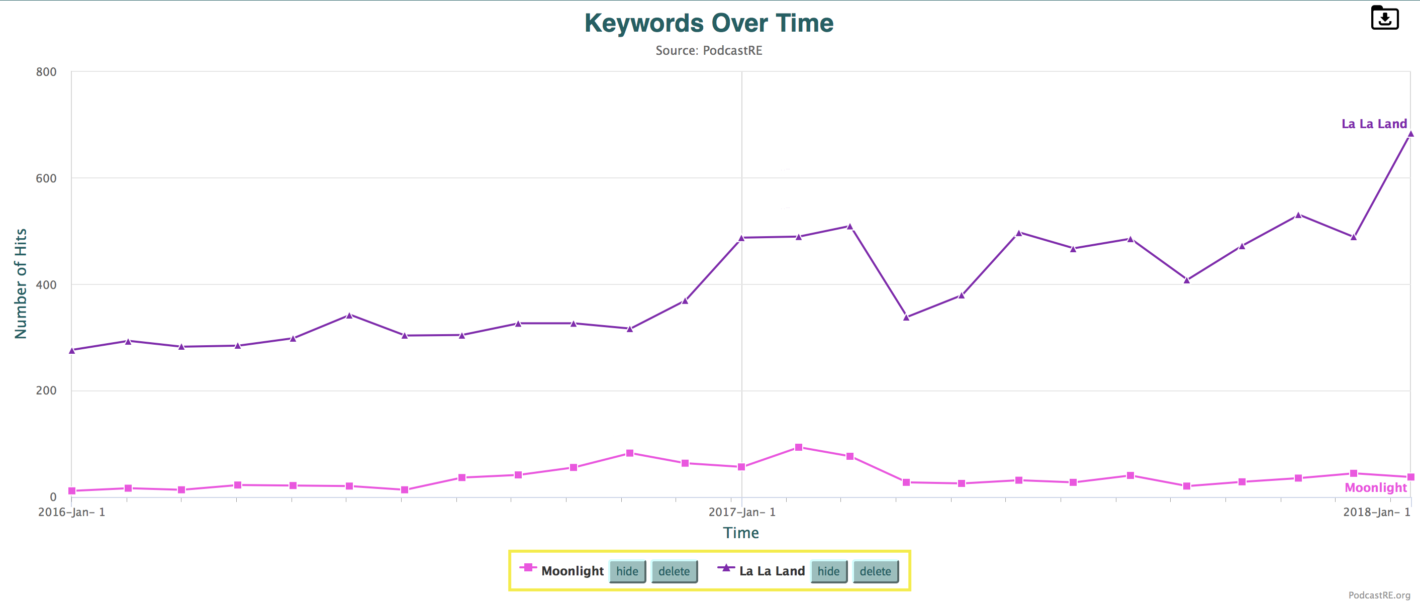
If you wish to clean up your graph, you can use the buttons below the x-axis to either hide terms (making them invisible but easily recoverable) or delete them (fully removing them from the graph).
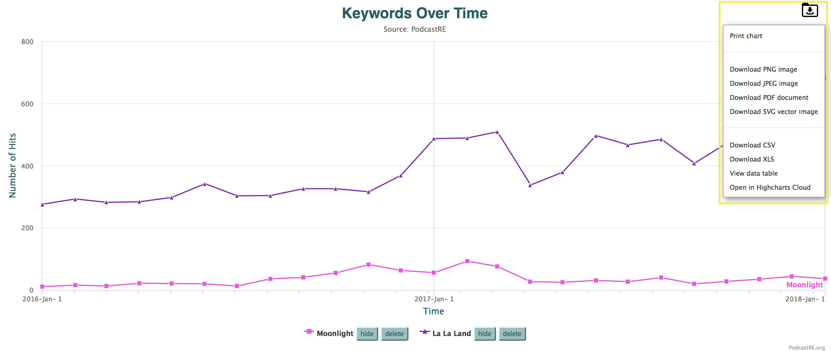
Graphs are also easily exportable. Simply click the download logo (as seen below) and you can save your graph as either as a .png image, .jpg image, .pdf document, .svg vector image, .csv or .xsl spreadsheet.
Whether you use it for the discovery of larger trends or as a new way into individual programs and episodes, PodcastRE's term frequency line graph tool can provide you with the important contextual information you desire.